Labels

Monday, 28 February 2011

FINAL DIGIPACK

Below is my finished Digipack. I have decided to stay simple in terms of imagery and fonts, as I feel this reflects the simplicity of my video. Arctic Monkeys do not have a logo, this allows for more creative freedom when it comes to designing and producing their album covers. Consequently there was less risk of my album cover appearing out of place amongst their others, had they had a distinctive logo that was recognisable on all their merchandise.

Sunday, 27 February 2011

FINAL MUSIC VIDEO


Here is my final music video for the song 'The Jeweller's Hands' by Arctic Monkeys. I have uploaded it to Youtube which would be the main distribution channel for the video if it was made professionally for Arctic Monkeys. As well as appearing on music television channels for example MTV, it would first be promoted online (usually via their website, which is where most of their music is first released to mainstream audiences. For example they have recently released Brick by Brick on their website without prior marketing or build up, they rely heavily on word of mouth and the internet distributing their music to their core audience). I took the frequently used theme of the divide between right/wrong, light/dark, to create this piece. I wanted to both show it in terms of the human psyche (with the notion that everyone has a dark side), as well as physically show the related imagery via shadow puppets and the use of costume in the dance sequence, as well as the changing light angles in the filler shots of the girl.

EDITING: Use of Photoshop and Editing Software

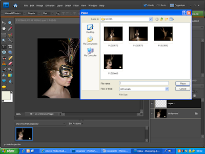
I used photoshop elements to create my digipack. I needed to use a more advanced photo editing software than iphoto because the front of the album was to be made up of two overlapping images. All the images were taken on the day of filming at various stages in the dance. Apart from the close up of the face on the front they were shot in the light of the spots rather than with flash, which has lent them a softer, warmer quality.


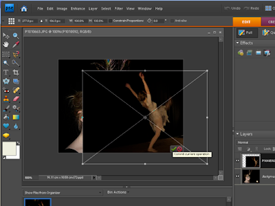
I placed the second image (the full body shot) over the top of the close up. Originally the spotlight was visible in the corner of the close up picture, however I used the dancer to cover that, as it did not look aesthetically pleasing in the corner of the picture.

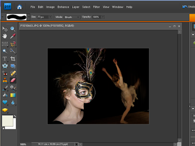
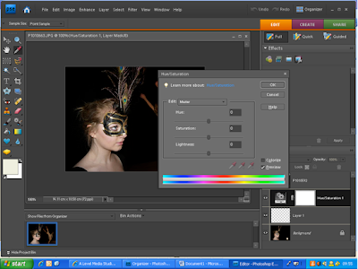
I used the eraser tool so that I had more control of which areas were erased. Once I had achieved the desired look in terms of juxtaposition, I altered the hue and saturation on the close up of the face, to a slightly more orangey glow. This was so the colours on the face and on the full body looked connected as the use of flash had created a much whiter light cast on the face. I wanted the image to look as if it could have been just one image, with the dividing lines between the two images being undetectable. I felt this would add to the polish of the digipack and create a more professional image.

Finally, I used the crop tool to make sure that the image was square and the dimensions of a digipack. I also added white text for the band name and song title - (for the full image see FINAL DIGIPACK).

EDITING: Filler Shots


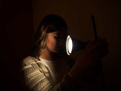
I filmed shadow puppets and another sequence of shots of a girl to use as 'fillers' between the dance sequence. I used the shadow puppets to further the light/dark imagery, and also to keep the video playful, as I felt the dance routine alone may bog down the video into a purely serious piece, whereas Arctic Monkeys' videos usually have a tongue in cheek element (for example their Cornerstone video which features solely Alex Turner serenading the camera). I felt that, though the dancer is the protagonist in my video, it needed to contain another person to avoid monotony, therefore I decided to film, mainly still shots of a girl in a white dress. The reason for the simplicity was so I could experiment more freely with the lighting, without the images becoming distracting by too many elements. For example I filmed most of the shots with the light on one side of the face to cast a dark shadow across the other side, and hint at another side to the girl/meaning to the image.

Another interesting element of lighting at this angle was that the shadow that formed looked like a completely different/detached person, and thus hinted to a sinister undertone. Therefore on some of the shots the light is being moved from aimed straight on to cast no shadow, to the side so that the audience can see the shadow forming as though it has taken on a life of its own. In these instances I had to speed up the footage, so that the clip would fit within one second, whilst still allowing for movement of the shadow.

EDITING: Constructing the Dance Routine

I was very sure from the start of my planning process that I didn't want the dance routine in my music video to look continuos, as though it was following a narrative. As I spoke about in an earlier post, I wanted my video to reflect the exclusivity that Lady Gaga portrays in Beautiful, Dirty, Rich, consequently I aimed to show snippets of the routine, as though the audience is being allowed momentarily into an unknown world (I also used to neutrality of the backdrop to amplify this). However, given that Jeweller's Hands is a relatively fast paced song, no clip is longer than 2 seconds, unless being used to compliment a down tempo piece of the music. Therefore with such short clips, I felt that I had to apply a small sense of continuity, such as when the dancer pirouettes, the next clip is of her feet pirouetting. I did this primarily so the piece would look less of a mish-mash of clips and the routine would have some fluidity, thus not distracting from the music.


Below is an example of two clips of the dancer mid pirouette. The first shows a long shot, where the whole dancer is within shot, and the second is a medium close up of her feet as she spins. I chose to put the two clips together for a number of reasons. Firstly, I felt the close up would not work effectively without another shot to illustrate what part of the dance is happening. Secondly, the shots are less than a second long each, and it looked much neater to have the two together rather than an elongated shot from one angle, and the other featuring later in the video. Therefore I have added more fluidity to my video, which will allow the audience to follow the action, where with short non corresponding shots it may become confusing, and too long draw out shots may become monotonous.


Due to the effort I put into lighting the location, I decided my piece would look more authentic, and true to the theatrical location of a stage, if I didn't apply any effects during editing. However the few clips that I did decide to alter where for fluidity reasons, rather than aesthetic. Due to the need for a sense of continuity between the different clips of the dance, there were a couple of shots that I decided to 'flip', so that the audience could keep track of where the dance was taking place and from what angle. For example the two shots below show a before and after of one clip that I decided to apply the 'flipped' effect to. I did this as I felt the clip worked well at that point in the song, yet the dancer had just been shown heading in one direction and consequently it needed to carry on from that particular point on the stage.

As the dance was not the sole body of my piece, as I have shadow puppets and filler shots of light/dark imagery to further the conceptual idea of my video, to edit in, I decided it was best to tackle the large proportion of my piece that was going to be made up of the dance routine first. This was purely from an organisational point of view, as I felt it would be easier to deal with each aspect in isolation. Consequently, where I knew I would interject a shadow puppet or 'filler shot' I placed a blank screen, so that I could continue editing the dance in time to the music, without risking later having to adjust clips that had fallen out of time as a result of the new shots. This is demonstrated below, where the seventh shot is a black screen.


PLANNING: Digipack Design

A lot of digipacks just have one image that corresponds with either the song title or one of the music videos featured on the album. I wanted mine to link to the music video, but at the same time I did not think I had taken a striking enough picture that would look professional and eye catching on its own. Consequently I decided to overlay two images on the front cover, both of the dancer featured in the music video, however one would be a close up and the other a full body shot to prevent it appearing monotonous or like a mirror image.
Above are the three images that I have chosen for my digipack. The close up of the face and the dancer kicking her leg up will both feature on the front and the other on the back. My reason for choosing to put the pirouette image on the back is that I feel it is a striking, and the contrast between light from the spotlights illuminating the dancer and the darkness surrounding is key to expanding on my original concept. Also the large black area to one side of the dancer will be useful for the list of songs, and will make it clear and easy to read if I use white text over the black.

Saturday, 26 February 2011

RESEARCH: Digipacks

Historically there have been cases where an album cover has overshadowed the content of the album. For example the Beatles' 'White Album', the tracks on which have not been heralded as their best or most popular, yet the blank cover has become infamous. In complete contrast, the Beatles' Sgt. Pepper, which is frequently named the best album of all time, both in content and cover design, shows the four Beatles surrounded by famous figures or 'heroes', at a point where this feat was only possible through the use of cardboard cut outs, and indeed waxworks of the band themselves in the early grey suit clad sixties (borrowed from Madame Tussauds).


A cover like Sgt. Pepper nowadays, though may be aesthetically pleasing, would not be considered advanced from a technological point of view. With the vast array of photo editing software, there is no end of what can be accomplished. Thus, quite often the best modern album covers are simplistic, or feature just one photograph. Over embellished album covers, that seem to include every effect possible so often look unattractive and undesirable. The simplistic covers are synonymous with indie groups, where an overcrowded album cover would not compliment the 'authenticity' and rough and ready style of music. Quite often indie artists will not appear on the album cover, rather more it'll be a photograph that corresponds to the album's name. For example Biffy Clyro's Mountains, which shows a painted image of two mountain lions fighting, and the white streaks create a mountainous feel. Thus the name is synonymous with the imagery. Similarly Arctic Monkeys' Whatever People Say I Am That's What I'm Not shows the image of man smoking. Though this in itself is not a particularly eye catching image, coupled with the album title, and the CD itself which boasts an ashtray, it is effective in making the audience question their initial perceptions of the scruffy man on the cover.

Indie bands often develop an image for themselves that sticks, and consequently becomes a feature of all their marketing campaigns. This is often the case when a band releases an album, and the other merchandise that is produced follows suit. For example Courteener's album Falcon features a falcon (again links between the name and image), similarly their posters boast the same imagery. This is to build up a brand identity, which is particularly important for new bands who are gaining a fan base, and aim to be easily identifiable. Two Door Cinema Club, being a relatively new band similarly promoted their album Tourist History with one image of a cat, which made their posters and tour dates quickly identifiable.

This marketing technique is one that I will use when designing my digipack and poster. They will vary slightly from each other in design but I will use the same photographs and colours so that there is a continuous theme throughout the merchandise.

RESEARCH: Analysis of Websites

Given that Two Door Cinema Club are a relatively new band, having only released one album, I was interested to see how sophisticated their web design would be, as a large amount of bands nowadays rely on their Myspace page to promote tours and gigs. However the design is advanced, both in terms of looks and function. For example their site contains the obligatory band name as the top banner, however rather than keeping top news and information on the home page, all additional info can be found under a heading leading away from the main page. Consequently this keeps each page uncluttered, and sleek, which instantly gives a professional feel. I hope to emulate this minimalistic style on my blog, by keeping to a monochrome colour scheme, which is in-keeping with both my album cover and magazine advertisement.


The Courteeners have a similar style of website as Two Door Cinema Club, however more is displayed on the homepage, so rather it allows the visitor to experience and navigate on the homepage. This is beneficial for those with a slow connection or browser as there is much less time spent loading the pages. However it does mean that each page needs to be very clearly laid out and under clear headings so that the large span of information navigated swiftly. I do not feel this will be a style I can recreate as successfully as the Two Door Cinema Club website, as a lot of information on the page makes it appear more amateur unless done very well. Also I feel within the constraints of web design company 'Weebley', I will not be able to emulate this successfully.

The Strokes website is of a similar style, however there is as much information but few links to other pages of the website. Rather they have favoured the approach of linking fans to external sites which are relevant, for example the band's twitter and presence on Social Networking sites. Due to The Strokes new album, much of the website is geared in the direction of promoting the other related merchandise, for example the advertisement at the side not only promotes the album, but also t-shirts available for sale also. This is important to not only draw the fans into the music but the whole band experience, and thus brining in other streams of revenue.

FILMING: On Location (Day Two)

Day Two
Time: 03.00 pm - 06.00 pm

Here are still images from my second day of filming. I did not use flash in any of these so that I could demonstrate the lighting more clearly (and the shadow puppets would have been invisible had I used flash).

Thursday, 10 February 2011

FILMING: On Location

Filming Day One
Time: 12.30 - 5.30

The first day that we filmed, we shot for five hours on the stage to get the dance routine. It was a lot of stopping and starting as I compiled the close up shots, for example the feet during a pirouette or the arms outstretched. However when I was filming the long shots from a distance to get the core of the dance routine, I set the camera up on the tripod and left it still whilst Beth danced. I chose to leave the camera still to make sure when it came to editing there would be a level of continuity between shots to show the routine progressing, whereas had I moved the camera it may be much harder to edit.

Fixing Beth's first costume, which was a white leotard and white feathered tutu. I made the tutu on the day to be sure it was the right size to fit around her waist.
Hannah contributed to the choreography, on the day Beth and her rehearesed between takes.

Due to filming in an enclosed area, it was important that I made clear which areas would or wouldn't be in shot. This was particulalry important when filming long shots, where the aim was to get full body footage.

I used gold reflectors for the close ups of Beth's face. This was consistent with the yellow glow that the lights gave off, and gave a warmer tint that I would have acheived with silver reflectors.

This was the second costume. It was identical to the first, but instead used black materials. I also decided she should wear a black mask to fully orchestrate the change from the first outfit. This was beneficial also, as the sequins reflected the spotlights and acted as a further light source. (particularly important as we were filming black on black.)