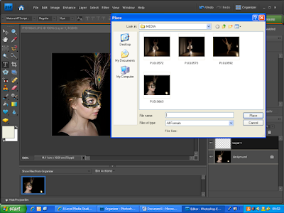
I used photoshop elements to create my digipack. I needed to use a more advanced photo editing software than iphoto because the front of the album was to be made up of two overlapping images. All the images were taken on the day of filming at various stages in the dance. Apart from the close up of the face on the front they were shot in the light of the spots rather than with flash, which has lent them a softer, warmer quality.


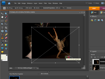
I placed the second image (the full body shot) over the top of the close up. Originally the spotlight was visible in the corner of the close up picture, however I used the dancer to cover that, as it did not look aesthetically pleasing in the corner of the picture.


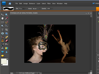
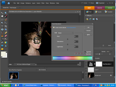
I used the eraser tool so that I had more control of which areas were erased. Once I had achieved the desired look in terms of juxtaposition, I altered the hue and saturation on the close up of the face, to a slightly more orangey glow. This was so the colours on the face and on the full body looked connected as the use of flash had created a much whiter light cast on the face. I wanted the image to look as if it could have been just one image, with the dividing lines between the two images being undetectable. I felt this would add to the polish of the digipack and create a more professional image.

No comments:
Post a Comment